

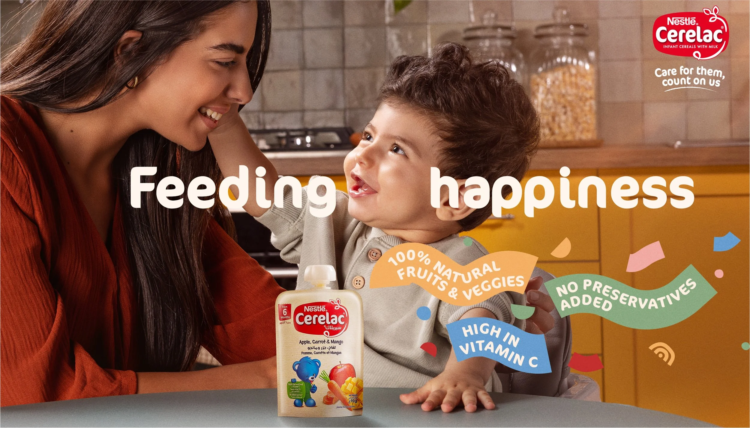
Ceralac feeding happiness
What feeds a mother’s confidence is knowing she’s giving her child the right nutrition for healthy growth. What feeds a child’s happiness is simply enjoying a meal that tastes good.
Cerelac Feeding Happiness brings these two ideas together — communicating the brand’s role in supporting both child and parent, physically and emotionally.
For this campaign, we reimagined Cerelac’s visual language — developing a refreshed look and feel that felt warmer, more modern, and emotionally engaging. As Art Director, I led the visual direction across the campaign, defining the aesthetic system from colour and typography through to imagery and composition.
The new direction was designed to feel more human and expressive, bringing a sense of joy and connection to the brand while maintaining clarity and trust.
This visual system was rolled out across campaign assets, social content, and digital touchpoints — ensuring consistency and cohesion across a high volume of outputs.