

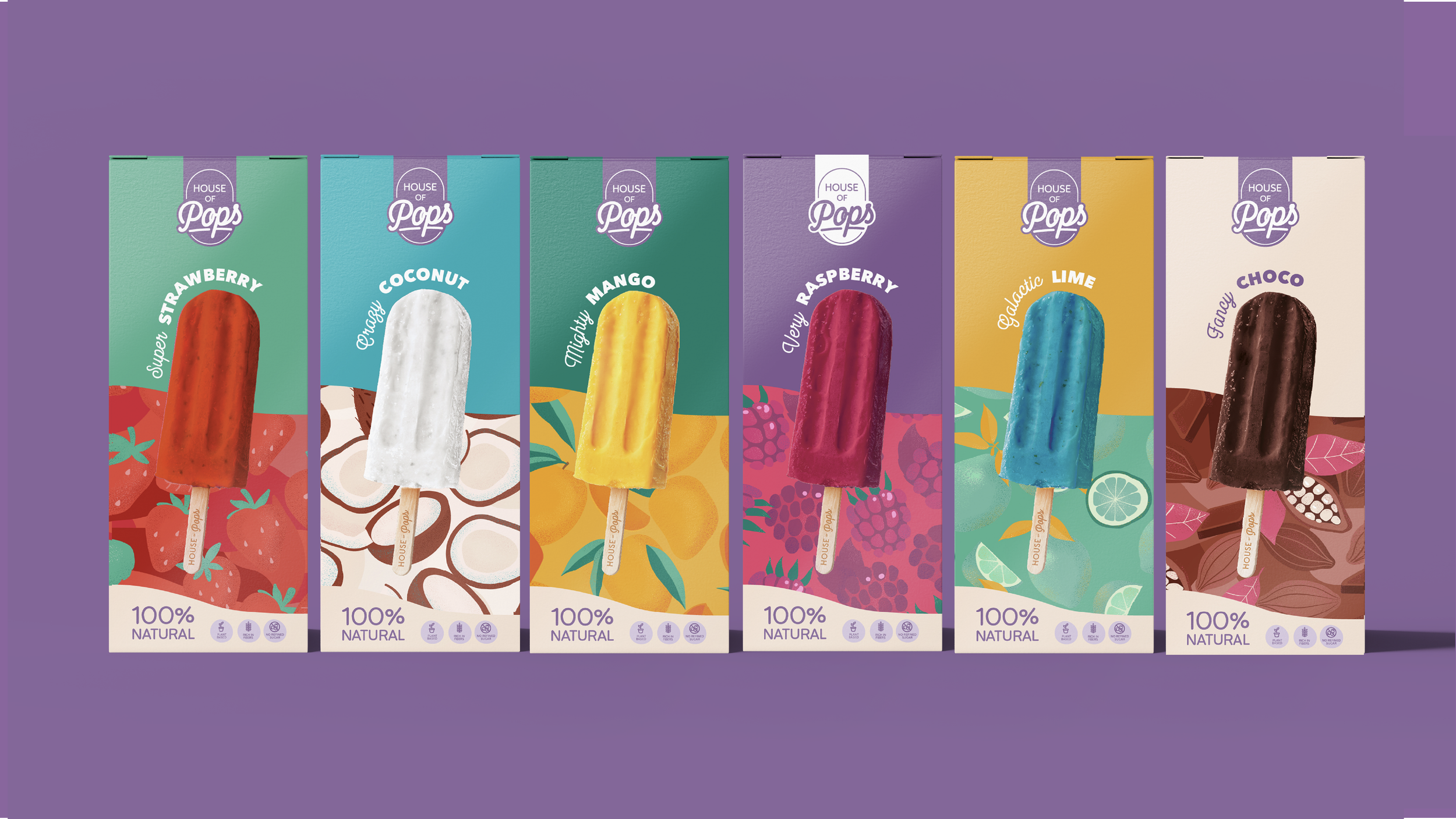
House of pops packaging design
House of Pops creates 100% natural, plant-based pops — made from real fruit, clean ingredients, and nothing unnecessary.
The challenge was to design a packaging system that felt just as fresh, vibrant, and full of personality as the product itself, while still nodding to its natural, eco-conscious positioning.
As Art Director, I led the development of the visual identity and packaging system — defining the colour palette, illustration style, and overall design language across the range. The focus was on creating a balance between playfulness and clarity, ensuring strong shelf presence while maintaining a considered and cohesive brand aesthetic.
The result is a bold yet structured packaging system that brings consistency across the range while allowing each flavour to stand out individually.

Every flavour was developed with its own distinct visual identity, built around a custom, hand-illustrated pattern designed to capture the essence of the ingredient. From punchy raspberries to creamy coconut, each design was crafted to feel expressive, recognisable, and cohesive as part of a wider system.

And the same love and care was taken in creating the multipacks.
